


Camros Tech
A B2B data analytics and solution development company helping companies drive growth and streamline their business.
Role
UX/UI Designer
Project Type
Web Design
Team
Sole Designer
Timeline
Aug 2024 - Oct 2024
Project context
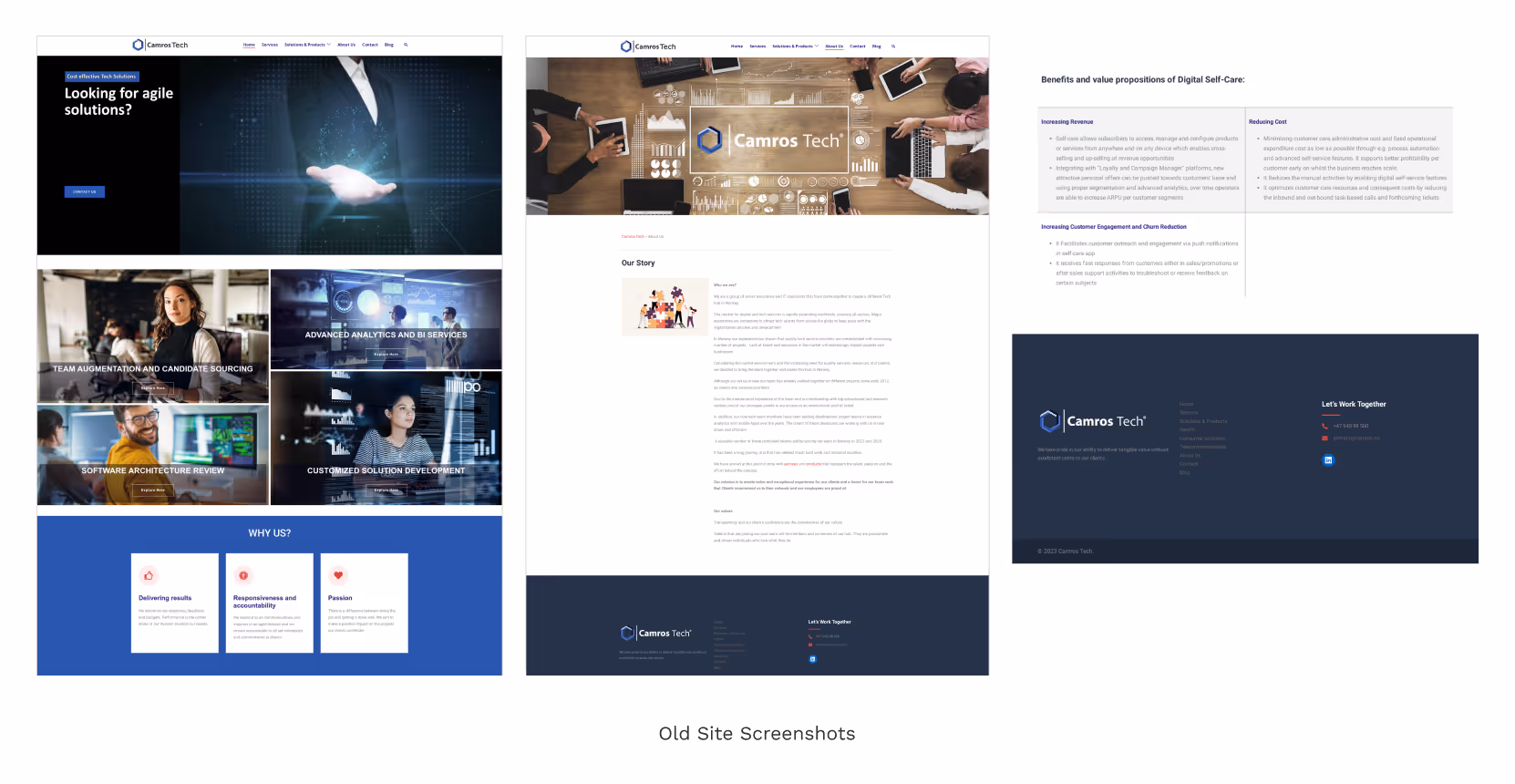
Camros Tech is a B2B tech company. They had an outdated site which was performing poorly. They were looking to build a modern and professional site which also solved key pain-points.
My role
As the UX designer, I conducted stakeholder interviews to better understand the goals and pain-points. Further usability tests and site evaluations were used to determine key site issues. Based on my findings, I ideated and sketched solutions which later were tested.
The problem
The site had a low conversion rate, poor SEO, and outdated visuals. Stakeholders were booking fewer monthly meetings than their target goal, which was having an impact on their business.
Goals
Redesign site with modern visuals and improved UX
Improve search engine optimization
Increase conversion rate to at least 2% and ideally 3%
Stakeholder interviews, usability tests, and analytics check-up are necessary to identify specific pain-points and ideate solutions.
Initial stakeholder interview
The objective was to gain a better understanding of their goals, target audience, pain-points, and perceived site issues.
Business goals and pain points
To expand outside their network and get more leads, the stakeholders planned to implement cold email outreach. Their site’s poor conversion rate was a critical issue they needed to fix before starting.
Findings
Lack of site metrics
Site built by software developers and not SEO optimized
Stakeholders felt the UX and visuals of the site likely had an impact on the conversion rate
Constraints: 1 month deadline to complete
Emergent goals
Check site analytics and identify relevant metrics, conduct usability tests and a site evaluation to determine key issues and identify potential solutions.
Site metrics
Low conversion rate
1.2%
Poor avg. session duration
52s
High bounce rate
74%
Pages per session
1.2
Based on these metrics, users were leaving the site quickly without exploring other pages. This indicates irrelevant traffic or issues with the content/UX.
Site traffic
A discussion with stakeholders revealed that all traffic until this point came through their network and consisted of target users, which means there was a problem with the content and/or UX.
Ideal user
Founders and executives in small to medium-sized companies within the Nordics. These individuals don’t have much technical knowledge and are interested in data/tech services.
Usability test
A careful evaluation of the site based on the usability test revealed these issues:
Poorly communicated value proposition
Unclear services
Text is confusing and highly technical
No client testimonials are logos
Poor CTA (no value)
Outdated and confusing visuals
Emergent goals
The site analysis clearly pointed out problems with UX writing and the critical need to speak with stakeholders in order to reformulate text for the site.
Stakeholder interview #2
I spoke with the stakeholders to gain in-depth knowledge of their services and industry in order to better formulate text for the new site. I provided them with my research findings and asked them to collect client logos, testimonials, and a list of important keywords.
Competitive analysis
A brief analysis was conducted of competitor sites which revealed trends which would solve some our our issues.
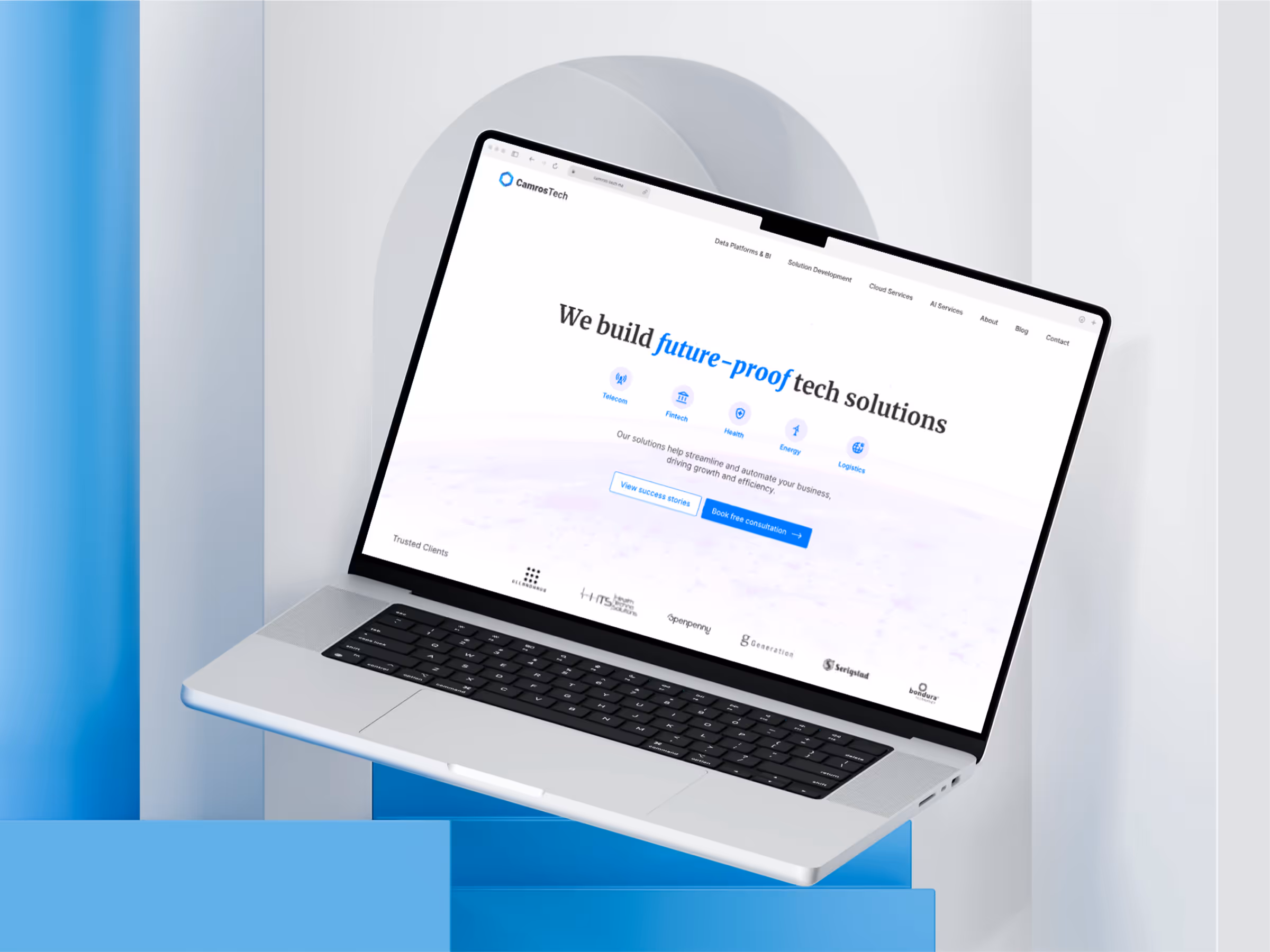
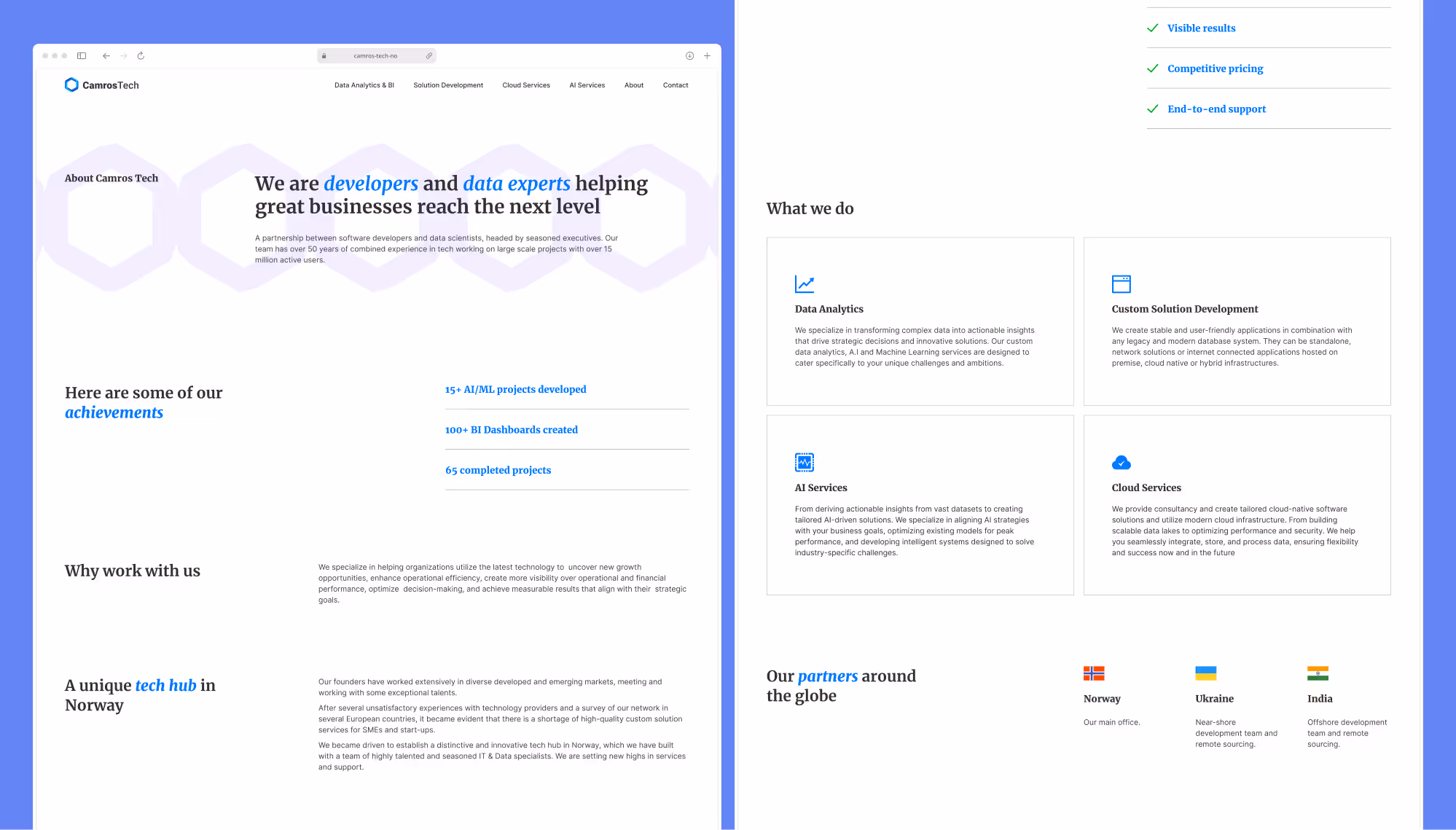
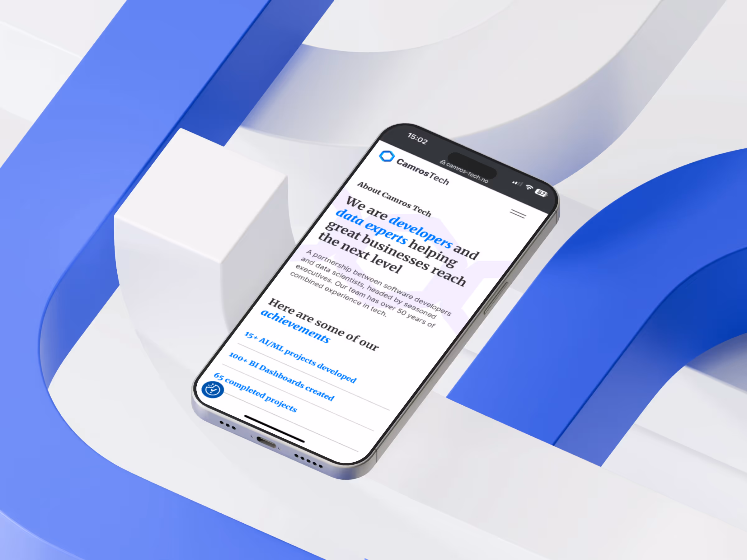
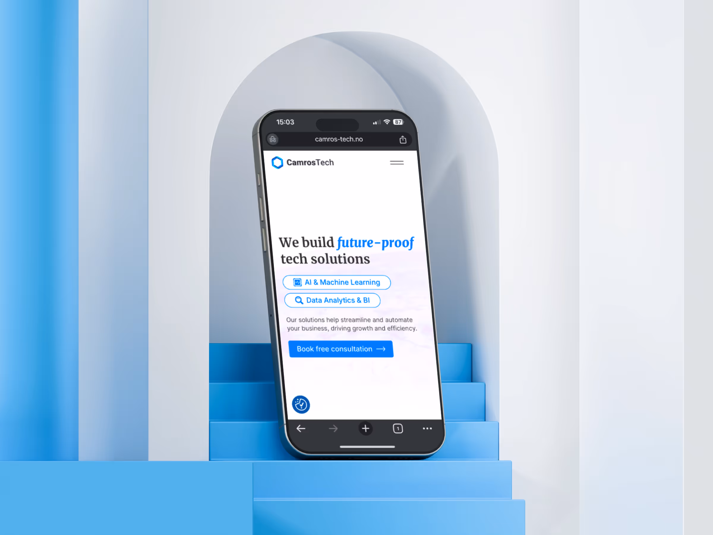
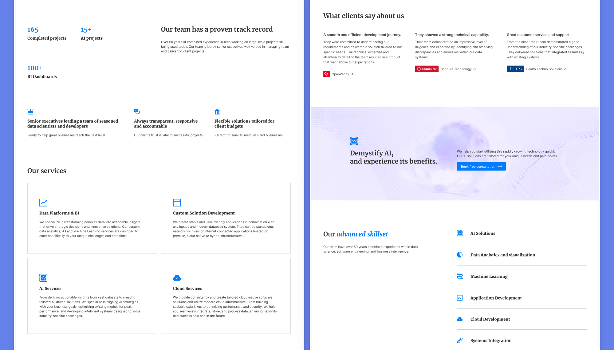
Well-formulated service statement
Success metrics
Client logos & testimonials
CTA offering a free consultation
Goal metrics
Conversion rate
Over 2%
Avg. session duration
Over 1:30 minutes
Bounce rate
Less than 60%
Pages per session
Over 1.5
Site design goals
Clean and modern design
Clearly defined and well-formulated services and benefits
Consistent use of keywords
Client logos and testimonials
Success metrics
CTA offering a free consultation
Redesign sketches
I began sketching ideas for design features based on the previous research and analysis.
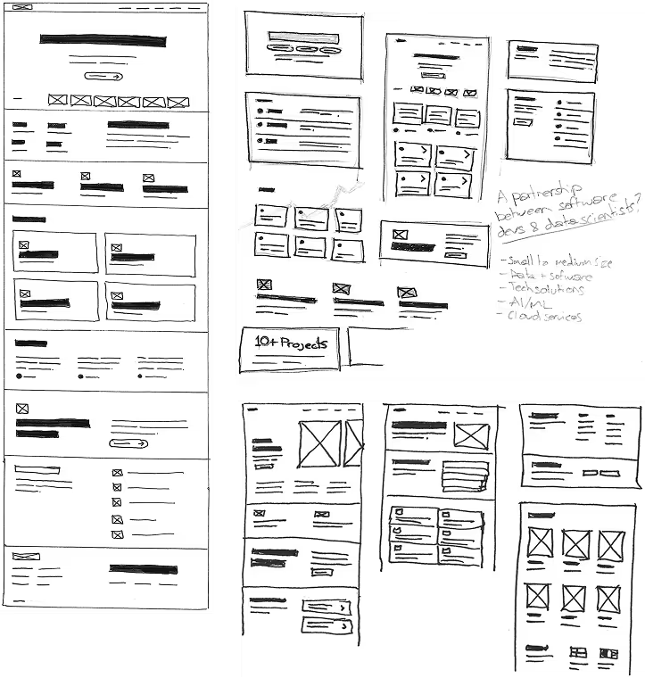
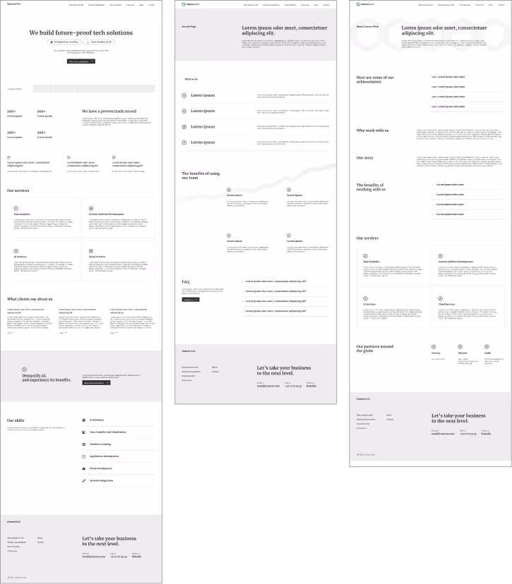
Wireframes
The best sketches were selected to build the wireframes.
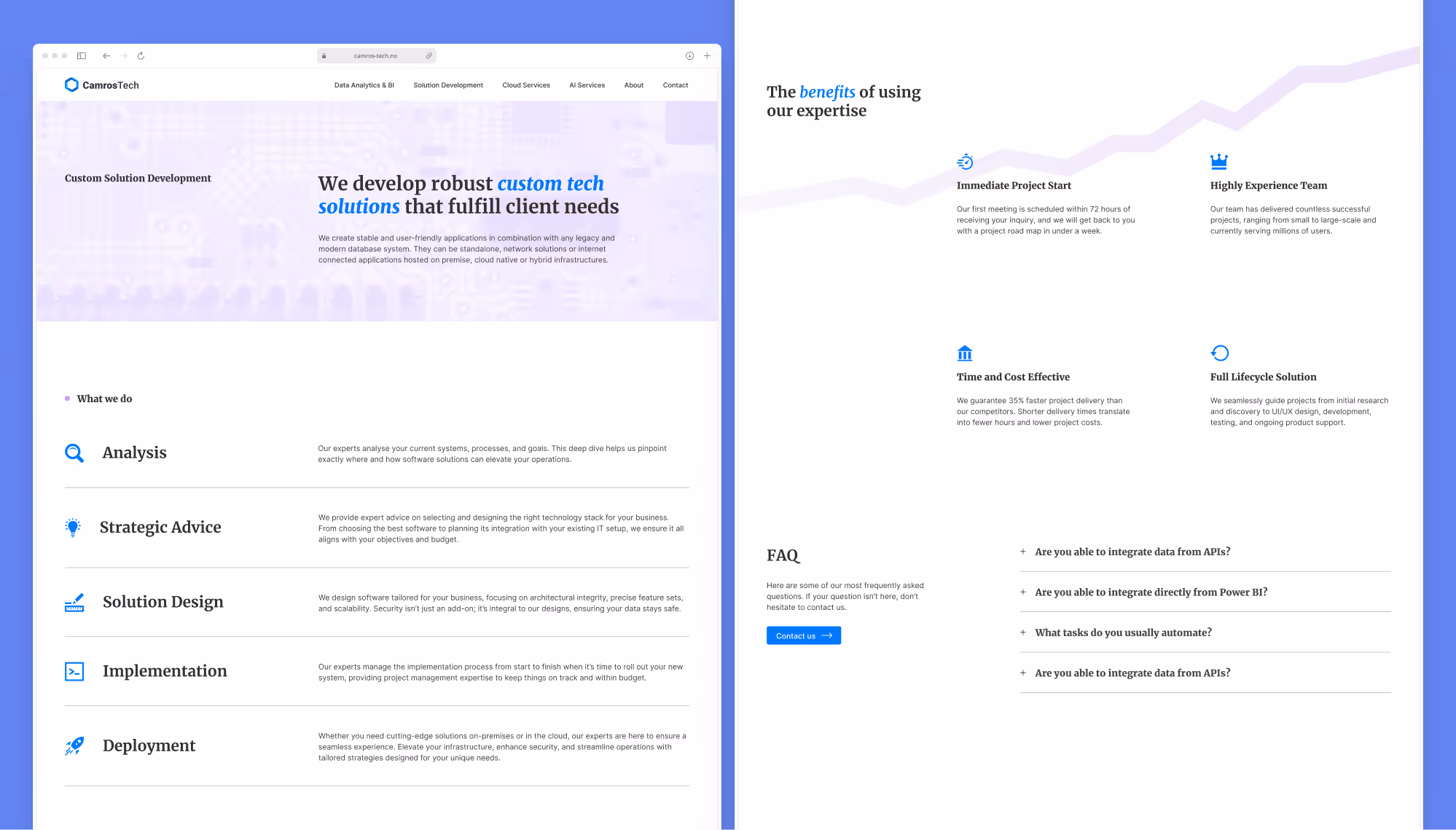
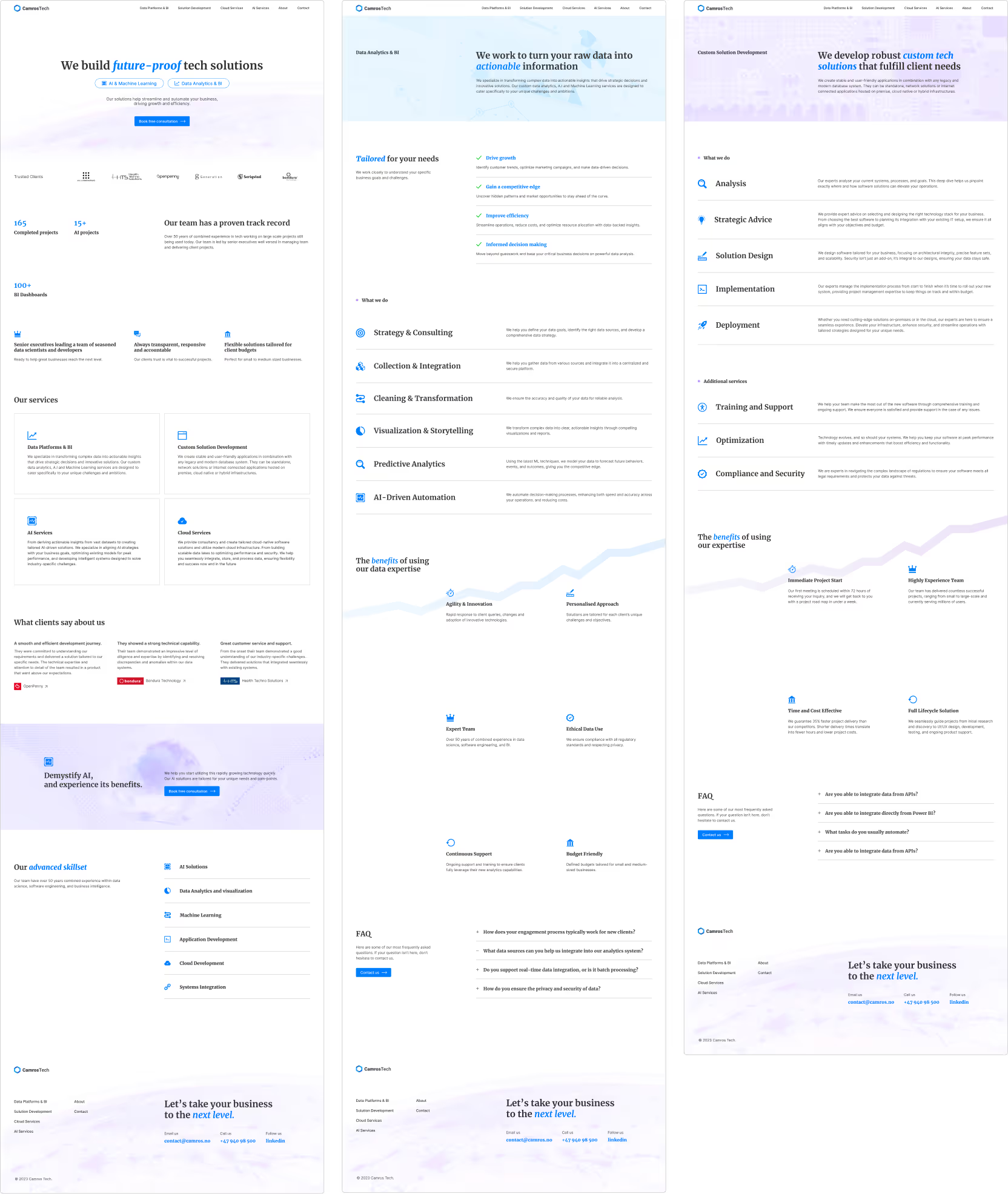
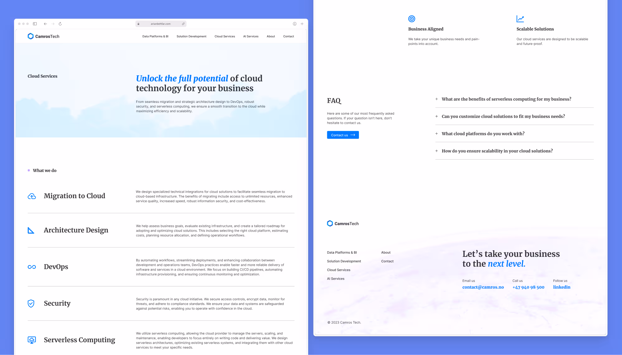
Final Mockups
Using my wireframes, I created high-fidelity mockups and a prototype of the site in Figma.
Usability test #2
I conducted a second think-aloud test with 3 new participants to determine if my new design solved the pain-points.The participants interacted with a polished prototype of the site in Figma.
Findings
The new design proved successful in user engagement.
Participants felt the site looked modern and professional
Participants felt the company was trustworthy
Participants clearly understood the services and benefits
Participants explored the site considerably longer
When asked, participants expressed interest in learning more and potentially contacting the company.
Results after 3 months
The new site proved successful and improved target metrics, increasing engagement and conversions for the client.The stakeholders were very happy with the results.
Site metrics
In addition, the site’s google ranking increased and visitor quality improved because of proper keyword usage.
Conversion rate
Over 2%
+300%
Avg. session duration
1:52 minutes
+115%
Bounce rate
52%
+30%
Pages per session
2.23
+86%
Project Takeaways
The most challenging and critical aspect of this project was formulating clear and concise text which accurately describes the company and it’s services. This required a lot of back and forth dialogue with the stakeholders because of their own struggle in communicating their services.
Site metrics
Considering the limited time and resources, the results were very good and the stakeholders were very pleased.I learned a lot about how to navigate stakeholder interviews and what type of questions to ask in order to better understand the project.